I like wrap-around covers. You know the ones where the image spills from the front, over the spine, tumbling on to the back cover? Yeah those – I like 'em. This is not to say I don't like any other kind of cover, but this style has a special place in my book-wormy heart.
Why do these covers strike such a chord with me? I love the reward when you pick up a book and find the story is continued across the cover and doesn't just end with the front image. It's an exciting idea to take a form that is generally portrait and create a concept that is landscape.
I find a good wrap-around cover is one that retains strength and the holistic concept even when all sides are viewed individually (front, spine, back). Like clever cropping of the landscape image to entice the customer on the cover and spine, along with the realisation of the image on the back cover to complement the blurb.
It may not increase the sale of a book, or make an impression on a large portion of book readers but this here book-nerd appreciates the subtle work.
Here are few lovely examples I was able to find:
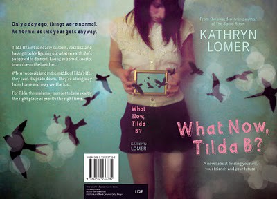
Designer: Zoë Sadokierski [University of Queensland Press]

Illustrator: James Gulliver Hancock [Simon and Schuster]
I would love to know what your favourite wrap-around cover is! Do you like them at all?
Astred Hicks


