Tuesday, August 31, 2010

It's a wrap!

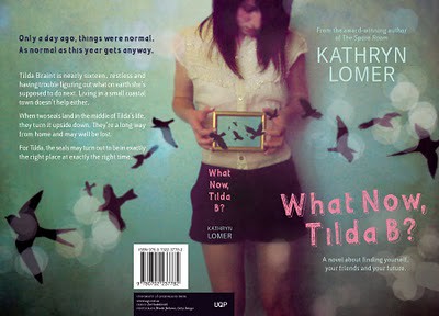
I like wrap-around covers. You know the ones where the image spills from the front, over the spine, tumbling on to the back cover? Yeah those – I like 'em. This is not to say I don't like any other kind of cover, but this style has a special place in my book-wormy heart.

Why do these covers strike such a chord with me? I love the reward when you pick up a book and find the story is continued across the cover and doesn't just end with the front image. It's an exciting idea to take a form that is generally portrait and create a concept that is landscape.

I find a good wrap-around cover is one that retains strength and the holistic concept even when all sides are viewed individually (front, spine, back). Like clever cropping of the landscape image to entice the customer on the cover and spine, along with the realisation of the image on the back cover to complement the blurb.

It may not increase the sale of a book, or make an impression on a large portion of book readers but this here book-nerd appreciates the subtle work.

Here are few lovely examples I was able to find:


Designer: Zoƫ Sadokierski [University of Queensland Press]


Illustrator: James Gulliver Hancock [Simon and Schuster]


I would love to know what your favourite wrap-around cover is! Do you like them at all?

Astred Hicks

Tuesday, August 24, 2010

Australian book design

I'm about to go off to do an industry session for Jo Waite at the publications subject in the RMIT Graphic Design course. It has set me thinking about the particular qualities of Australian design.

Awhile ago I met a New York designer who'd studied for a year at Swinburne and his comment about Australian design was that because the stakes weren't as high here as in the US, and we had tight budgets, designers here were willing to take risks that they weren't on the other side of the Pacific, which made Australian design much more interesting, even when projects were intended to be quite commercially. I think it's true of our theatre too, and maybe of Australian arts culture in general.

Another comment I came across about Australian design that I particularly liked is that it marries passion with pragmatism.

Wednesday, August 18, 2010

Sandra!

Just thought I'd give the whole technology thing a whirl and post something.

Nice one Sandy. Great to see you starting this up.

Regards

Optimize Legibility - Web Type


Thought I'd share this post about what is possible.

http://www.aestheticallyloyal.com/public/optimize-legibility/

This'll do your head in

Hi All,

Cheers to Sandy for setting up the blog, well done. Saw this cover in my local bookstore yesterday.


Not sure if it is a local design or not. The book is Sleepless by Charlie Huston. Must be the best example of some optical fun since Stefan Sagmeister's Made you look. Strangely, it was the one cover in a sea of books that I noticed. Maybe because I was busy imagining how you get a piece like this through the sales and marketing dept of a large publishing house. The text is completely illegible up close and only becomes readable when you move about a metre or two away. Bit of fun...

Cheers,
Phil Campbell

Tuesday, August 17, 2010

Book Covers, online resources and iPad stuff

Hi all,

Sandy invited me to post some stuff related to what I'm doing with books on the iPad, or as I like to call them 'AppBooks'.

Book Covers

First up, I'd like to share the following site I think you'll appreciate:


It's an online archive of book covers spanning more than a century of art. Hours of fun and inspiration for all.

A couple of websites

If you're looking for one of the many social media/sharing design sites that are all the rage at the moment to get feedback on your own or comment on other's work, I recommend dribbble.com and forrst.com. Dribbble's been around for a while. It's hard to get an account with them and it's pretty exclusive, but you can at least browse the content. Forrst on the other hand is one of the new start ups catering to both designers and developers. You can't view the content without an account, but you can sign up for an invite. I think there's a 2-4 week wait as Kyle (who runs the site) is scaling conservatively in terms of members and also tweaking and guiding the general content and character of the community. Forrst is less prestigious than dribbble, but is a friendly and encouraging network of people who will often post helpful suggestions on ideas and designs you are working on. I'm really enjoying it.

iPad stuff

I've been making iPhone apps for a couple of years and am now working on iPad apps with Appbooks. We will soon be releasing a fun iPhone/iPad app of 'Animalia' by Graeme Base.

My current passion is trying to come up with a solution to creating AppBooks for the iPad, and - as they come on the market - other 'tablet' devices running other OS like Android, in the belief that the future is an inevitable one in which digital books outsell printed books (and where printed books still exist but the market is smaller and has adapted somewhat... but that's a post for another time!). If you don't believe me, I can testify that I already purchase many more digital books than printed books - to the extent that sometimes I won't buy a book if it's not available in digital format.

Lately, I've been working on developing a cross-platform solution for AppBooks with the possibility (where appropriate) of some audio, video and/or animation enhancements. I've played a bit with ePub and Kindle books, but I find them quite boring right now and very limiting in terms of what you do with formatting (bugger all, unless in-line photos and the same fonts you had on your Apple 2E are your thing).

It's been a bit of a challenge as the industry is still very much in transition and moving a lot slower than I anticipated. While there is a certain interest in and anticipation for digital books, one can be quite confused trying to make sense of it all at present. And sadly, in Australia there seems to be in a 'wait and see' attitude that lets the US unnecessarily take the lead on this stuff.

'Darby'

A few years ago, Sandy Cull designed my book 'Darby' - she did an amazing job - you can see a couple of examples of the design here. Over the past week or so I've started playing with it as an example of what is possible on the iPad. With apologies to Sandy's design - although I am being guided by the design principles she implemented - I am adapting the book to the iPad and attempting to support both portrait and landscape orientations as per Apple's recommendation. Of course, I may decide that's too hard and lock it to landscape ;-)

It's been a bit of a challenge. One of the issues with supporting two orientations - and what are likely to be different dimensions to a book that was designed for print - is deciding whether to crop full page images for both orientations or decide on one for full screen and the other to display as a smaller image with white or black space either side.

For example, if a book was full screen in portrait mode, then in landscape you could choose to centre the portrait image leaving 'white space' either side. I may not do this with my own book - as I can make the creative decisions about its presentation - however when presented with adapting someone else's book design, I see this as a potential solution that maintains the integrity of the photos and without having lengthy discussions with the original designer, author or photographer.

For those familiar with HTML coding, in order to reformat for both orientations you run two different CSS files which show/hide on an orientation change.

I've been stoked to finally work out how to embed fonts on the iPad last week - so theoretically, an AppBook could look very similar to it's printed cousin. I see it as a valuable way of setting AppBooks apart from eBooks and thereby working towards a well designed reading experience on devices like the iPad (although I am beginning to think of it more as a 'guided' experience of the story that is being told).

I'm also excited about the possibilities of dynamic moving text, fading it in and out, adding audio as 'atmos' tracks or 'on tap' events, or including video and slideshows. Basically most of the things you can do with a website (without Flash which doesn't run on the iPad) you can probably do on the iPad. The challenge of course is not to go overboard. Sandy referred to the Alice app on the iPad in her first post on this site. I think that's a great example of restraint and often refer to it when talking about what a good enhanced book experience can be on the iPad. I could imagine using it to lull my nephews to sleep as a bed time story. Unfortunately, there are also many other examples that are more like watching a movie (see the Toy Story app on the iPad). On the other hand there are other iPad books that encourage the reader to engage and interact with the content - tapping here or there, solving a puzzle, looking for a hidden element - and that do it in a way that opens the reader's mind to explore further the creative intent of the author.

There is much I could add, but feel free to contact me if you'd like to discuss any of this stuff (via my website www.tootable.com). Always keen to do that!

In the meantime, I hope to share some of my thoughts and progress on the 'Darby' AppBook and post some links to examples of how it is looking in the coming weeks and get some feedback.

I would also welcome debate on the future of book design with you on this blog. I'm not a book designer. The closest I come to that is wearing my hat as a mobile developer or author. I'm fascinated to see how the publishing and book design industry is going to develop to embrace digital books. I'm also excited about how authors, illustrators and storytellers are going to approach a hybrid future where books, video, audio and websites are all formats that are available as storytelling mediums of entertainment, study, manuals, 'cookbooks', 'novels' and biographies... the stuff that we know as books now.

The book publishing industry is in transition - we've already seen it happen with music, photography and a number of other industries. I don't believe it's the death of books as some have tried to convince us - it's an adaptation to a new medium - an extra one - in our continued desire to consume, learn, engage and contribute to the age old tradition of telling, sharing and enjoying stories.

Liam
Sunday, August 15, 2010

this is series mum

Gayna Murphy has referred us to Miriam Rosenbloom’s inspired hardback poetry series for Faber and Faber using British printmakers. It's really worth reading Miriam’s post about the process. A dream job in every sense with a beautiful result.
http://www.thethoughtfox.co.uk/?p=2419

And Andrew Kelly has commented on the shift in design sensibility shown in Cath Crowley’s young adult fiction.
http://www.heatherbrewer.com/books/index.php

Des Cowley, rare books curator at the State Library, recently asked my opinion of the new series design from Penguin UK for their European Classics
http://thepenguinblog.typepad.com/the_penguin_blog/2010/05/central-european-classics.html
and David Pearson’s re-branding of Cormac McCarthy's entire list.
http://bookcoverarchive.com/cormac_mccarthy

So, some thoughts about series design.
 

Everyone loves a series design and to be briefed to do one is likely to have any designer punching the air. I punched the air when Rob Cullinan from UQP called me a few years back to re-brand their poetry series. I really had to stop myself from offering to do it for free. What I loved most about the brief was that it had a very tight budget. These books had to become more financially viable to be publishable. Having steadfast limitations, particularly at a time when publishing was going through an embellishment juggernaut, was incredibly refreshing. 

I am also currently working on the Australian city series for UNSW press. Hobart
was the first release, followed by Brisbane, published last week, with Sydney and Melbourne in the pipeline. What I love most about working on this series is the opportunity to source images for each cover that are a little unusual. It's been really inspiring to not be asked to design something that looks like something else. And any opportunity to avoid using the ubiquitous stock libraries has to be encouraged.

There's must be a huge publicity benefit with any series. Each book in the series points to the others in the series and collectively, the series creates a bigger impression on the general public. The plethora of serialised literature is a perfect example of how successful this can prove to be. Think Steig Laarsen, Stephanie Meyer. It makes one wonder if being part of a series can be a books' brightest selling point? And if so, is this a recent phenomenon and what are the pitfalls if any? And is there such a thing as a dream job when all is said and done, and would you do it for free?


Thursday, August 12, 2010

Designer Disco

Hi there,
Jay Ryves here from Future Classic Design.

We have an event coming up this weekend in Sydney aimed at bringing together designers and will be lot's of fun - so although not specifically about book design it will probably be of interest.

As part of Sydney Design we're hosting a special event at Adult Disco at the Civic in partnership with our friends at Australian Infront.

Designer Disco is a free event on Saturday 14 August at 10pm on the ground floor of the Civic Hotel (cnr Pitt and Goulburn St, Sydney) and in the lane way behind the Civic. We have invited 15 design studios to each create an original artwork to be displayed on a light box based around the theme of music and using the Adult Disco pink and black. All these designers have worked on design for music but many have also designed books.

Amazing works will be on show by Alter, Greedy Hen, Leif Podhajsky, Like Minded Studio, Mathematics, Marico Maricar, one8one7, Shane Sakkeus, Sensory, Sopp Collective, String Theory, Toko, We Buy Your Kids and of course Future Classic Design! All works are for sale for $400 too - so you might just end up with an amazing new lightbox for your wall!

Would be great to see you there - we have a nice little catalogue to give away for those who get down early, thanks to our good friends at Peachy Print, and some Adult Disco mix CD's too.

To get you in the mood we're giving away 15 top Future Classic tracks paired with artworks form the show. Check them out here. (click the arrows at the right to play a track and see the image - click the image to enlarge)

Please forward on to anyone you know who might be interested - great chance to network with lots of creative folk!

Big love,

Future Classic

Sunday, August 8, 2010

about book design

About Book Design is . . . well . . . about book design. A new forum for anyone interested in publication design, whatever that comes to mean in our shiny, bright ipad world.

I am Sandy Cull, a freelance book designer based in Melbourne, Australia. Since leaving the comfort and relative safety of a buzzing design studio in a large publishing house, it's become apparent that there's not much communication between the many individuals within the publishing industry. We're all beavering away in a front room somewhere or sharing studio spaces and offices and bashing away at the keyboard. Alas, we're not getting together much to collaborate, or discuss, to refer work, to inspire, to congratulate or to educate. I spoke with a number of designers and publishers at this years Sydney Writers Festival and specifically, at the APA Book Design Awards back in May, and all of you without exception, were keen to get something happening along these lines. So . . . About Book Design is born.

Share your thoughts and your observations, invite each other to exhibitions or events, create some dialogue for debate and reflection. Ask questions about contracts, copyright, fees, finishes, contacts. Please feel free to contribute and comment here in any way that you think would be of interest and let me know if you'd like to post something. It's a hugely exciting time in the industry – there is simply so much going on and so much to ponder. Illustrators, educators, photographers, designers, animators, typesetters, librarians, literary agents, editors, publishers, authors, printers, book makers, book readers, book sculptors, book lovers, book tragics, welcome to you all.

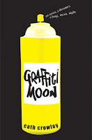
To start the ball rolling, I thought I'd acknowledge a fab new cover that I saw today for young readers. Published by Pan Mac, it's called Graffiti Moon and designed by Melanie Fedderson from i2i design. My 11 year old gave it a huge thumbs up too.
 

I also thought I'd like to refer you to a youtube many of you may have already seen showing the ipad app of Alice in Wonderland.

http://www.youtube.com/watch?v=gew68Qj5kxw

And Wired magazine has also released it's first few digital releases of it's mag specifically designed for the ipad – each for $4.99. It took me about 12 minutes to download a 500mg file of the first issue onto the ipad and it was worth the wait. There's lot of negative press about the ipad. You've heard it all, but if this isn't a revolution in publishing then I don't know what is. Wired for the ipad is a one stop shop. Still with all the traditional magazine content, including some of the best illustration and photography around, but it's now enhanced with stop-animation, short film, multi-layered captions, music samples, direct downloads, links to websites and instant language translation to name but a few features. And, thankfully, not every page is animated. Judicious restraint can't be underestimated in design and the digital Wired design makes for a perfectly paced media experience.

Make sure you have a squizz if you haven't already. What do you think?

http://itunes.apple.com/us/app/wired-magazine/id373903654?mt=8