In answer to my original query, many fonts of knowledge have contributed – thanks to you all for your time. Have cut and pasted here for all our benefit . . .
From a brilliant copyright expert at Penguin, "the Publisher would also have to purchase the font to use it . . . This is an absolute nightmare when selling overseas rights or licensing on our covers . . ."
From another brilliant copyright/production/font expert at Penguin, "[the] freelance designer would have to hold a licence to the fonts . . . however we, the publisher would need to purchase font licences also – we would bring files in house, to print out and circulate if nothing else, to do corrections, and to archive. The repro house would also need to hold font licences. The foundries are going to do very well out of this, but it is important that we are in strict compliance will all font licences."
And from the ever helpful and brilliant art director, Deb Brash, "Foundries have had the same licences and agreements for ages, but are cracking down on ensuring that the often confusing and complex licensing agreements are adhered to."
Thanks again everyone.
Wednesday, September 22, 2010


Tuesday, September 21, 2010
Anyone a font of knowledge?
I was chatting with a publisher the other day and we got onto fonts. Who owns them, what obligations do we have as designers and publishers? I buy a few fonts, usually through Fontfont, MyFonts or Veer. Font Space has loads of free fonts but you need to make sure you check for any restrictions on their use. I believe, perhaps a little naively, that we should always do the right thing here.
Anyway . . . as long as I have purchased the font and thus have a licence to use it for commercial needs and, as the publisher has employed me to design the book, there shouldn't be any obligation for the publisher to purchase the font as well. Or should there? Anyone?
Anyway . . . as long as I have purchased the font and thus have a licence to use it for commercial needs and, as the publisher has employed me to design the book, there shouldn't be any obligation for the publisher to purchase the font as well. Or should there? Anyone?
Tuesday, August 31, 2010
It's a wrap!
I like wrap-around covers. You know the ones where the image spills from the front, over the spine, tumbling on to the back cover? Yeah those – I like 'em. This is not to say I don't like any other kind of cover, but this style has a special place in my book-wormy heart.
Why do these covers strike such a chord with me? I love the reward when you pick up a book and find the story is continued across the cover and doesn't just end with the front image. It's an exciting idea to take a form that is generally portrait and create a concept that is landscape.
I find a good wrap-around cover is one that retains strength and the holistic concept even when all sides are viewed individually (front, spine, back). Like clever cropping of the landscape image to entice the customer on the cover and spine, along with the realisation of the image on the back cover to complement the blurb.
It may not increase the sale of a book, or make an impression on a large portion of book readers but this here book-nerd appreciates the subtle work.
Here are few lovely examples I was able to find:
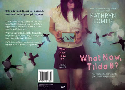
Designer: Zoë Sadokierski [University of Queensland Press]

Illustrator: James Gulliver Hancock [Simon and Schuster]
I would love to know what your favourite wrap-around cover is! Do you like them at all?
Astred Hicks
Why do these covers strike such a chord with me? I love the reward when you pick up a book and find the story is continued across the cover and doesn't just end with the front image. It's an exciting idea to take a form that is generally portrait and create a concept that is landscape.
I find a good wrap-around cover is one that retains strength and the holistic concept even when all sides are viewed individually (front, spine, back). Like clever cropping of the landscape image to entice the customer on the cover and spine, along with the realisation of the image on the back cover to complement the blurb.
It may not increase the sale of a book, or make an impression on a large portion of book readers but this here book-nerd appreciates the subtle work.
Here are few lovely examples I was able to find:
Designer: Zoë Sadokierski [University of Queensland Press]
Illustrator: James Gulliver Hancock [Simon and Schuster]
I would love to know what your favourite wrap-around cover is! Do you like them at all?
Astred Hicks
Tuesday, August 24, 2010
Australian book design
I'm about to go off to do an industry session for Jo Waite at the publications subject in the RMIT Graphic Design course. It has set me thinking about the particular qualities of Australian design.
Awhile ago I met a New York designer who'd studied for a year at Swinburne and his comment about Australian design was that because the stakes weren't as high here as in the US, and we had tight budgets, designers here were willing to take risks that they weren't on the other side of the Pacific, which made Australian design much more interesting, even when projects were intended to be quite commercially. I think it's true of our theatre too, and maybe of Australian arts culture in general.
Another comment I came across about Australian design that I particularly liked is that it marries passion with pragmatism.
Wednesday, August 18, 2010
Sandra!
Just thought I'd give the whole technology thing a whirl and post something.
Nice one Sandy. Great to see you starting this up.
Regards
Optimize Legibility - Web Type

Thought I'd share this post about what is possible.
http://www.aestheticallyloyal.com/public/optimize-legibility/
This'll do your head in
Hi All,

Cheers to Sandy for setting up the blog, well done. Saw this cover in my local bookstore yesterday.
Not sure if it is a local design or not. The book is Sleepless by Charlie Huston. Must be the best example of some optical fun since Stefan Sagmeister's Made you look. Strangely, it was the one cover in a sea of books that I noticed. Maybe because I was busy imagining how you get a piece like this through the sales and marketing dept of a large publishing house. The text is completely illegible up close and only becomes readable when you move about a metre or two away. Bit of fun...
Cheers,
Phil Campbell
Subscribe to:
Posts (Atom)